Tools
Screen printing
Analogue projector
Adobe Photoshop
Adobe Indesign
Adobe Illustrator
Canon 700d
Category
Photography
Image making
Editorial
Year
2014
Editorial illustrations for two books with Penguin Competitions.
1. The Big Sleep - Raymond Chandler
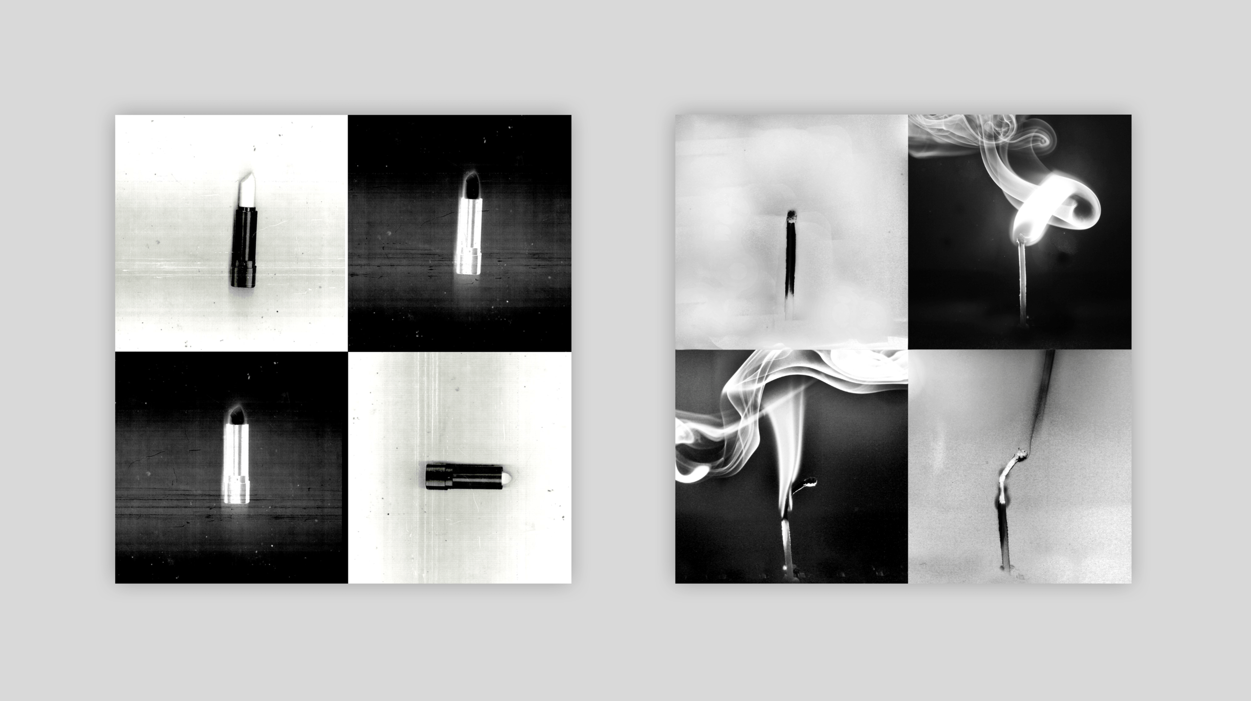
A series of four internals were created in addition to the book cover all hand screen-printed and heavily processed photography. Conceptually showing how time complicates, darkens and warps the plot as it inevitably marches on throughout the novel.
For the final cover, 6 matches were photographed, representing the 6 characters who are murdered within the novel. The smoke portrays each of their individual stories slowly and almost gracefully becoming twisted and intertwined within each other, becoming more complex to untangle as time goes on and the plot deepens. The use of matches heralds back back to the 1940’s era, in which they were common-place. Interestingly the longer a match burns the more warped, crooked and distorted it becomes. Serving its purpose by dying out; mirroring the novel’s plot.
Four prominent objects throughout the novel were chosen to work with for the internals, they follow the concept of time eroding, destroying, and darkening. Another key theme throughout is how the protagonist (Detective Marlow) is referred to as a chess knight. Each internal image represents a section of a chess board, with the concept of black vs white/ bad vs good. The detective strategically making the his moves.
Designed using:
Aphex Twin - Film
James Blake - CMYK
Youandewan - 1988
David August - Epikur
Mount Kimbie - Made to Stray
Arkist - Fill My Coffee
Dark Sky - Leave
Hijak - Tears
Ifan Dafydd - Treehouse
Phil France - The Swimmer
Tools
Screen printing
Adobe Photoshop
Adobe Indesign
Adobe Illustrator
Canon 1000d
Category
Photography
Image making
Editorial
Typography
American Typewriter
Gill Sans Regular
2. One Flew Over The Cuckoos Nest
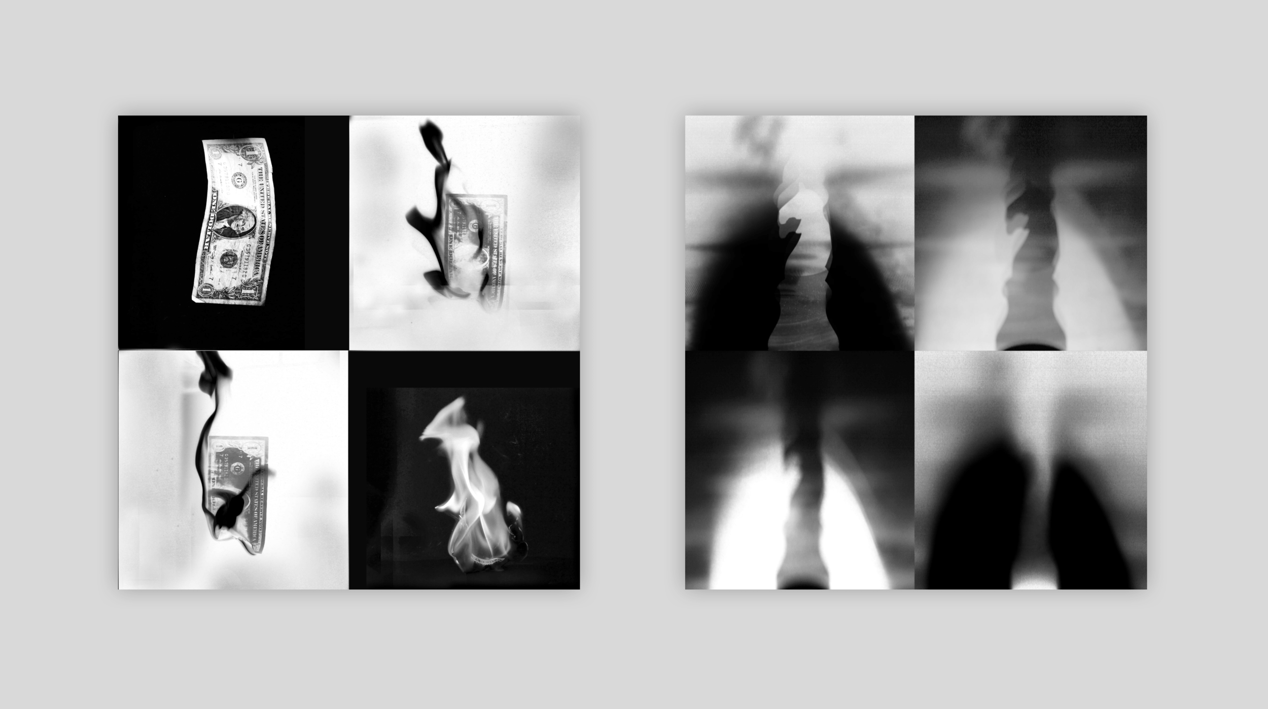
The screen-printed and highly processed final images reflect the protagonist McMurphy and his refusal to abide to a strict predetermined regime – thus breaking the system.
A concept of 'breaking the system' was visible throughout this project. An idea, which was conceived through noticing the definite and monotonous pattern that took place in the novel by Ken Kesey. The inmates would religiously follow a daily routine of getting up, taking medication, eating, playing cards, taking medication, eating, group therapy, eating, taking medication etc. That is until McMurphy becomes present and his massive influence disrupts the whole flow of the perfectly oiled machine that had been previously ticking on day by day.
The cover shows this concept but also displays a key scene in the novel in which all the patients take their medication, but McMurphy refuses, thus the beginning of his influence.
The internal illustrations also follow this concept and show a monotonous pattern, with one drastically different object showing a hint of bright red, symbolising McMurphy's influence. All screen printed on news print, an aged effect was created which echo's the era in which the novel is set - the late 1950's.
“Man, when you loose your laugh, you loose your footing.”


