Tools
Adobe illustrator
Adobe Photoshop
Screenprint
OlympusOM10 35mm
Camera-less photogram
Canon 700d
Category
Branding
Identity
Photography
Year
2021
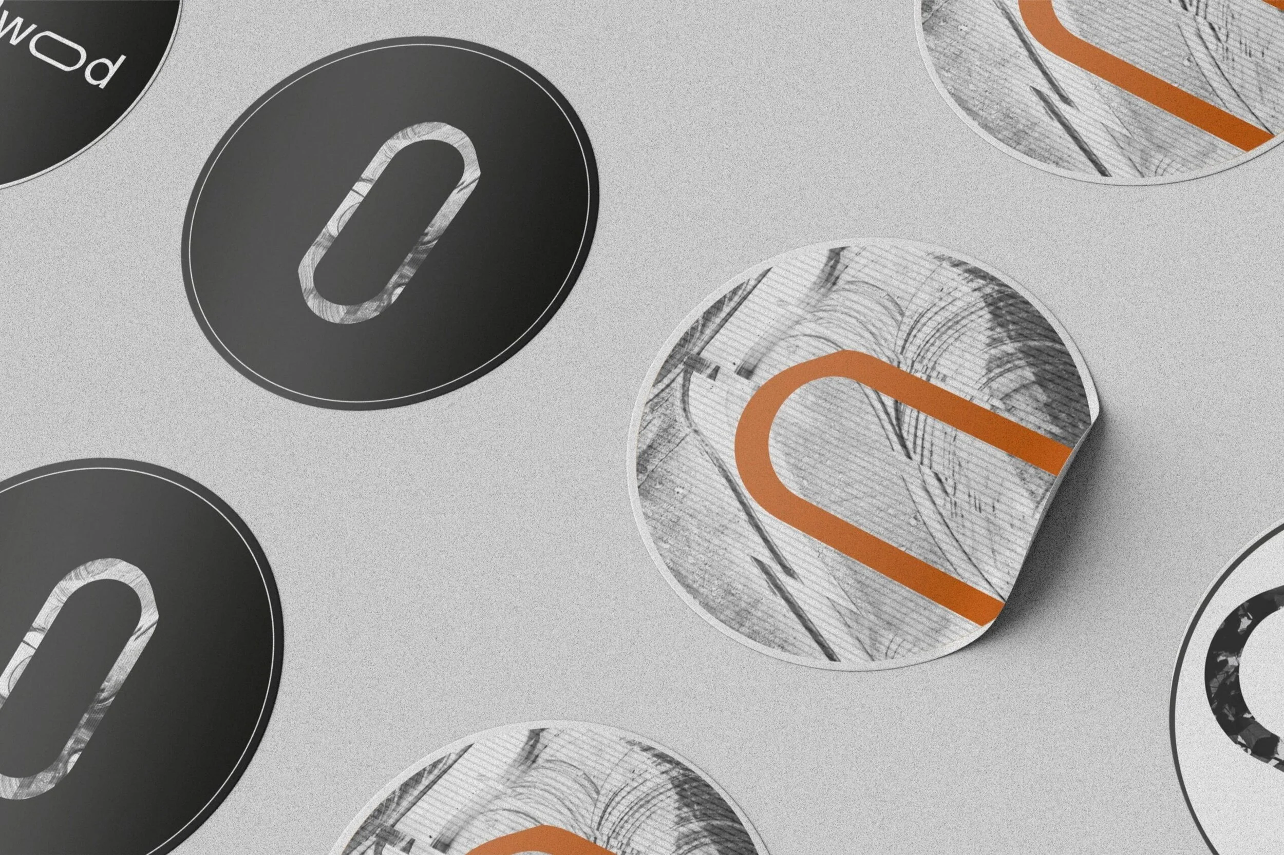
Sometimes I like to operate within in the tension & harmony of two opposing worlds. Connecting & exploring within the grey areas; searching for unsuspecting beauty hidden within the nuance. This project was about creating a personal identity – I focused on a constant and remerging theme within my life of finding the balance between two opposing worlds:
The organised and the natural.
The geometric and organic.
The digital and analog.
I like to play within the tension of these subjects in many areas of my life from music I listen to, the way I dress to my design sensibilities.
“combining warm calligraphic curves with a clean, machine-like sensibility, bridging the organic and mechanical genres” Johannes Breyer, talking about Prophet typeface (Dinamo Foundry)
Designed using:
Bicep - Saku
Martyn Heyne - Carry
Somni - Moonlight
Dabrye - How Many Times
Chants - Porch Song 1am
Portico Quartet - Prickly Pear
Turtle - Blood Type ft. Eliza Shaddad
Leon Vynehall - Envelopes
Space User - Planets
Jon Hopkins - Immunity
Image making
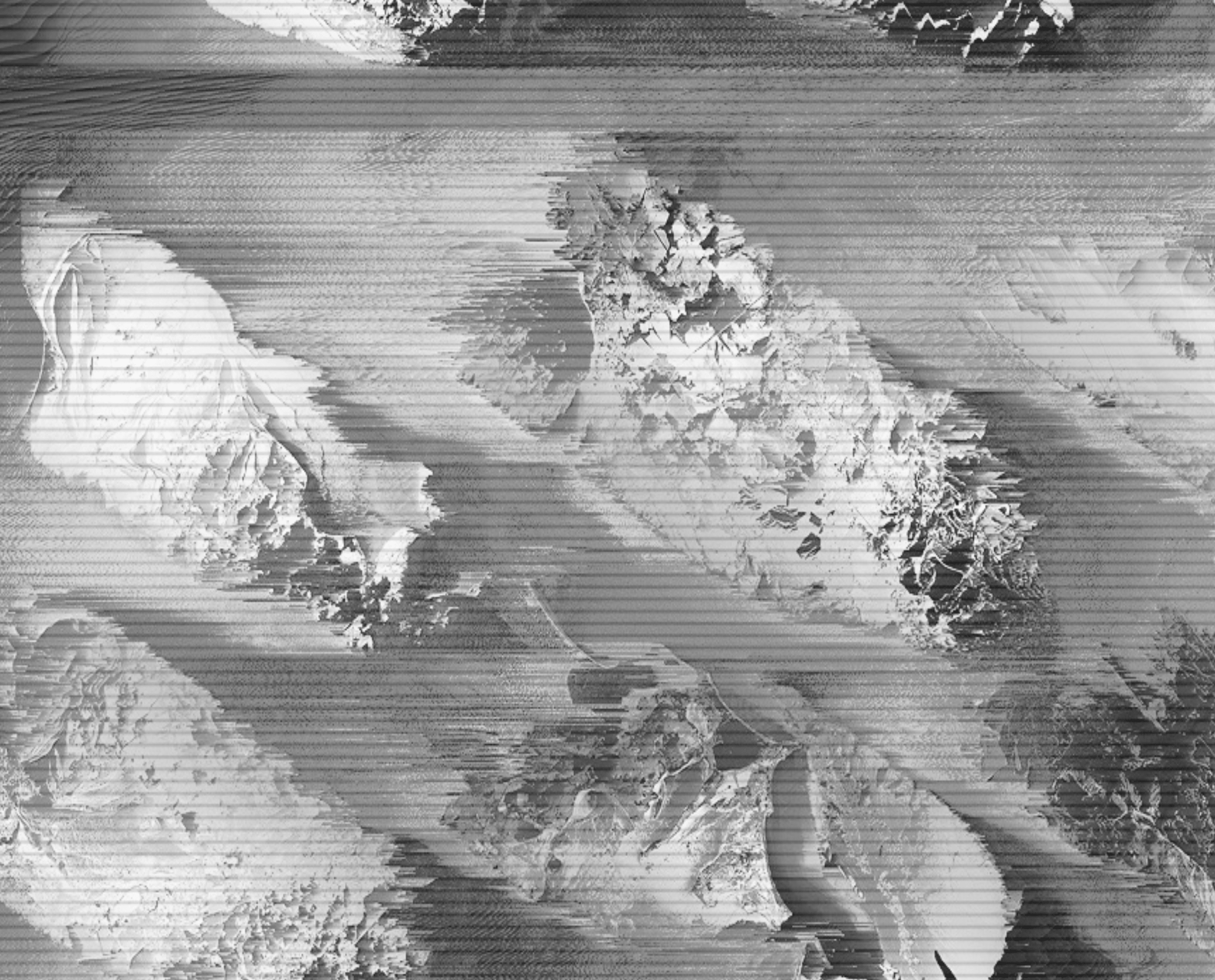
Fusing the organic natural with digital manipulation. Here is a selection of personal photos. Including a frozen puddle, incense stick smoke, glass of water and mountain range from above. Heavily processed, each image is treated with a similar method of inverting, monotone then finally a touch of ‘glitch’, in an attempt to play with the unpredictable tension of these two contrasting worlds.
“Combining warm calligraphic curves with a clean, machine-like sensibility, bridging the organic and mechanical genres”


